Today the Curtin Open Knowledge Initiative is releasing a resource that has been in the works for a long time. The new Open Access dashboard provides information on the OA status of research outputs by country and by institution. It provides some surprises and reinforces some of what we know. But at its base it provides a comparison of hundreds of countries and tens of thousands of institutions in their journey towards making research outputs accessible.
What we show
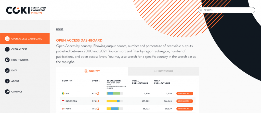
The dashboard shows how accessible research outputs are; as well as how the open access version is being made available. For example, it is possible to see and compare open access via publisher websites and via repositories from 2000-2021 by country and by institution. This is shown in aggregate over the whole period and by year of publication. Click through from the list on the front page to see details of a specific institution or country, or search for a particular one of interest using the search bar.
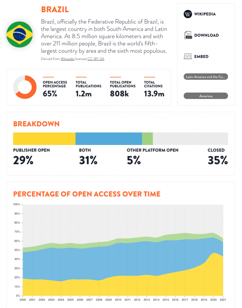
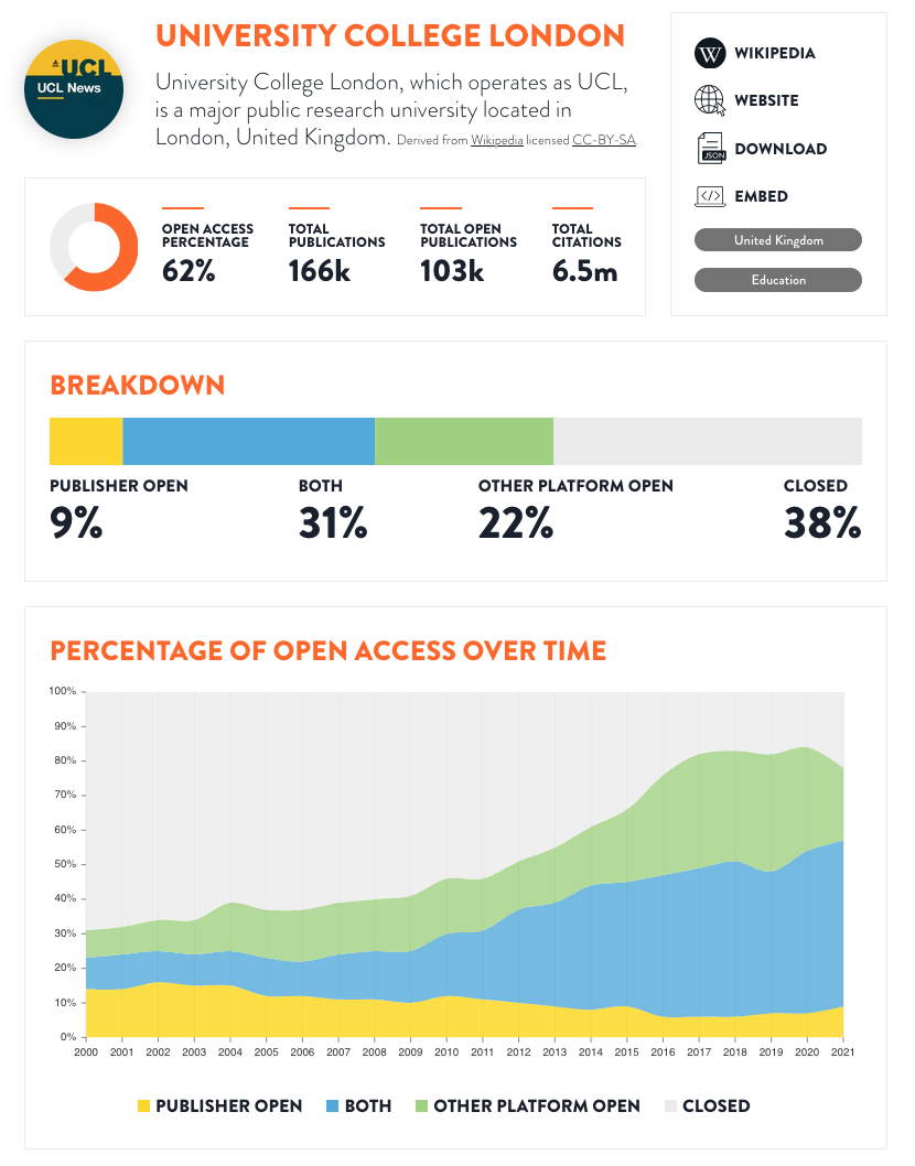
We also chose to explicitly show where outputs are accessible via both routes. Rather than privileging access via publisher websites, by ignoring cases where an output is available via both routes, we think it is important to emphasise that both approaches are operating in parallel. This is important in understanding the differences in how open access is being delivered.
If you don’t like the way we’ve displayed or analysed the data, you can get the data yourself and use your own approach. Of course, the data is also open, being derived from Microsoft Academic (soon to be OpenAlex), Unpaywall and ROR. The workflows that process the data from those sources, through to the code running the website itself are, of course, all available. If you are inclined you can offer a pull request for the website text, or provide us with direct feedback.
What is still coming
This is a work in progress and under ongoing development. Soon to come are filters to allow you to select subsets of countries or institutions, based on region, country, volume of outputs and others. On each details page we also hope to provide a breakdown of repository based access. Similar to the publisher doughnut graph, but allowing for overlapping categories (something can be both a preprint, in a disciplinary repository and/or in an institutional repository in various forms from presubmission through to author final manuscript to the published article).
Finally we also hope to offer an embed functionality where you can take a graph or page and insert it into your own websites. Watch over the next few months as the functionality grows.
“Dashboards” vs “Rankings”
Is this a ranking? You can sort by overall open access, so yes, if you try hard enough you can turn this into a ranking. Perhaps even more so once the filters are added. We heard a demand for enabling comparisons, just as we know that rankings are an impoverished means of understanding comparisons. Our goal was to produce something that can be intelligently used, and critiqued, not something that adds to the flood of simplistic information sources.
There are a lot of design decisions we took that de-emphasise the rankings concept, but also the sometimes surprising order in which countries and institutions appear should also perhaps give pause to those who want over-simplistic comparisons. If you embrace the complexity you will get more out of the data.
What is next?
We could continue working on this for some time yet. We wanted to release it to gain community feedback, identify issues and priorities. And also to surface and visualise data that is not always easy to engage with. You can provide feedback, technical, data-focussed or design via github, twitter or directly. And please do tell us stories of how you use this information in your own work!